
ver wondered what the world *really* thinks about a new movie, a trending product, or a political event? Companies and researchers spend millions trying to answer that question, but the secret often lies hidden in plain sight: in the endless stream of conversations happening on social media. Welcome to the world of **Sentiment Analysis**.
This is one of the most popular and impactful applications of Natural Language Processing (NLP), a fascinating branch of machine learning. In this hands-on, beginner-friendly **Python sentiment analysis tutorial**, we are going to build a simple yet powerful tool that can analyze real Twitter data and determine whether the sentiment of a tweet is positive, negative, or neutral. You'll be amazed at how easily you can start uncovering public opinion with just a few lines of Python code.
Table of Contents
What is Sentiment Analysis?
Before we dive into the code, let's quickly understand the core concept. What are we actually trying to achieve?
Sentiment Analysis, also known as opinion mining, is the process of computationally identifying and categorizing opinions expressed in a piece of text. Its primary goal is to determine the writer's attitude towards a particular topic, product, etc., as positive, negative, or neutral. It's a way to quantify subjective information.
For example, the sentence "I absolutely love the new Gemini AI model, it's incredible!" would be classified as **Positive**. Conversely, "I'm so frustrated with this buggy software update" would be classified as **Negative**. The sentence "The phone is black" would be considered **Neutral**, as it states a fact without expressing an opinion.

Our Tools for the Project
We will use a small but powerful set of Python libraries to accomplish our goal quickly and efficiently.
For this project, you don't need a complex setup. We'll be using a fantastic library called **TextBlob**, which provides a simple API for common NLP tasks, including sentiment analysis. It's built on top of more powerful libraries like NLTK but makes the process incredibly easy for beginners.
- Python: The programming language of choice for data science.
- TextBlob: A user-friendly library for processing textual data.
- Pandas: For organizing our data into a clean, easy-to-use DataFrame.
- Matplotlib: For visualizing our results with a simple chart.
Prerequisite: This tutorial assumes you have a working Python environment. We highly recommend you follow our Ultimate Guide to Setting Up Python for Data Science. It will ensure you have Anaconda and can create a dedicated virtual environment for this project.
Step 1: Setting Up Your Project Environment
A clean environment is the key to a successful project. Let's create an isolated space for our sentiment analyzer.
First, open your Anaconda Prompt (Windows) or Terminal (Mac) and create a new virtual environment specifically for this project. This prevents conflicts with other projects.
- Create the new environment:
conda create --name sentiment_project python=3.11 - Activate the environment:
conda activate sentiment_project - Now, install the required libraries into our active environment.
pip install pandas textblob matplotlib - TextBlob requires some additional data (corpora) to work correctly. Run this command to download it:
python -m textblob.download_corpora
Your workspace is now ready! Let's get to the fun part.
Step 2: The Code - Building the Sentiment Analyzer
It's time to write the code. We'll do this in a Jupyter Notebook for an interactive experience.
Launch JupyterLab by typing `jupyter lab` in your terminal. Create a new notebook and follow along with the cells below.
Cell 1: Import Necessary Libraries
First, we import the tools we just installed.
import pandas as pd
from textblob import TextBlob
import matplotlib.pyplot as plt
import re

# Set plotting style
plt.style.use('ggplot')
Cell 2: Load Your Twitter Data
For this tutorial, we will use a sample CSV file containing tweets about a topic. You can find many such datasets on websites like Kaggle. For now, let's assume we have a file named `tweets.csv` with a column named `text` that contains the tweet content.
In a real-world project, you would use the Twitter API (now X API) to collect live data. However, for a learning project, using a pre-existing CSV file is much simpler.
# Load the data into a pandas DataFrame
# Make sure your 'tweets.csv' file is in the same directory as your notebook
try:
    df = pd.read_csv('tweets.csv')
    print("Dataset loaded successfully!")
    print(df.head())
except FileNotFoundError:
    print("Error: 'tweets.csv' not found. Please create a sample CSV with a 'text' column.")
    # Create a dummy dataframe for demonstration purposes if the file doesn't exist
    dummy_data = {'text': [
        "I love using Python, it's so versatile and powerful!",
        "This new AI model is absolutely mind-blowing. The results are amazing.",
        "I'm so frustrated with the latest update, my computer keeps crashing.",
        "The documentation for this library is terrible and confusing.",
        "The weather today is cloudy.",
        "OpODab has the best AI tutorials!"
    ]}
    df = pd.DataFrame(dummy_data)
    print("Created a dummy DataFrame for demonstration.")
Cell 3: Cleaning the Tweets
Raw text data from social media is messy. It contains usernames, links, special characters, and more. We need to clean it before we can analyze it. We'll create a simple function to handle this.
def clean_tweet(tweet):
    '''
    A utility function to clean the text in a tweet by removing links,
    special characters, and usernames using regex.
    '''
    return ' '.join(re.sub("(@[A-Za-z0-9]+)|([^0-9A-Za-z \t])|(\w+:\/\/\S+)", " ", tweet).split())

# Apply the cleaning function to our 'text' column
df['cleaned_text'] = df['text'].apply(clean_tweet)
print("Cleaned text examples:")
print(df[['text', 'cleaned_text']].head())
Cell 4: Performing Sentiment Analysis
This is where TextBlob makes our life incredibly easy. We'll create a function to get the "polarity" of a text. Polarity is a float value between -1.0 and 1.0.
- **-1.0** means very negative
- **0.0** means neutral
- **+1.0** means very positive
We'll also create a function to categorize this polarity score into "Negative," "Neutral," or "Positive".
def get_polarity(text):
    return TextBlob(text).sentiment.polarity

def get_sentiment(polarity):
    if polarity > 0:
        return 'Positive'
    elif polarity == 0:
        return 'Neutral'
    else:
        return 'Negative'

# Apply the functions to our DataFrame
df['polarity'] = df['cleaned_text'].apply(get_polarity)
df['sentiment'] = df['polarity'].apply(get_sentiment)

print("DataFrame with sentiment analysis results:")
print(df[['cleaned_text', 'polarity', 'sentiment']].head())
Step 3: Visualizing the Results
Numbers are great, but a picture is worth a thousand words. Let's visualize our findings to easily understand the overall sentiment.
A pie chart is a perfect way to show the proportion of positive, negative, and neutral tweets in our dataset. We'll use Matplotlib for this.
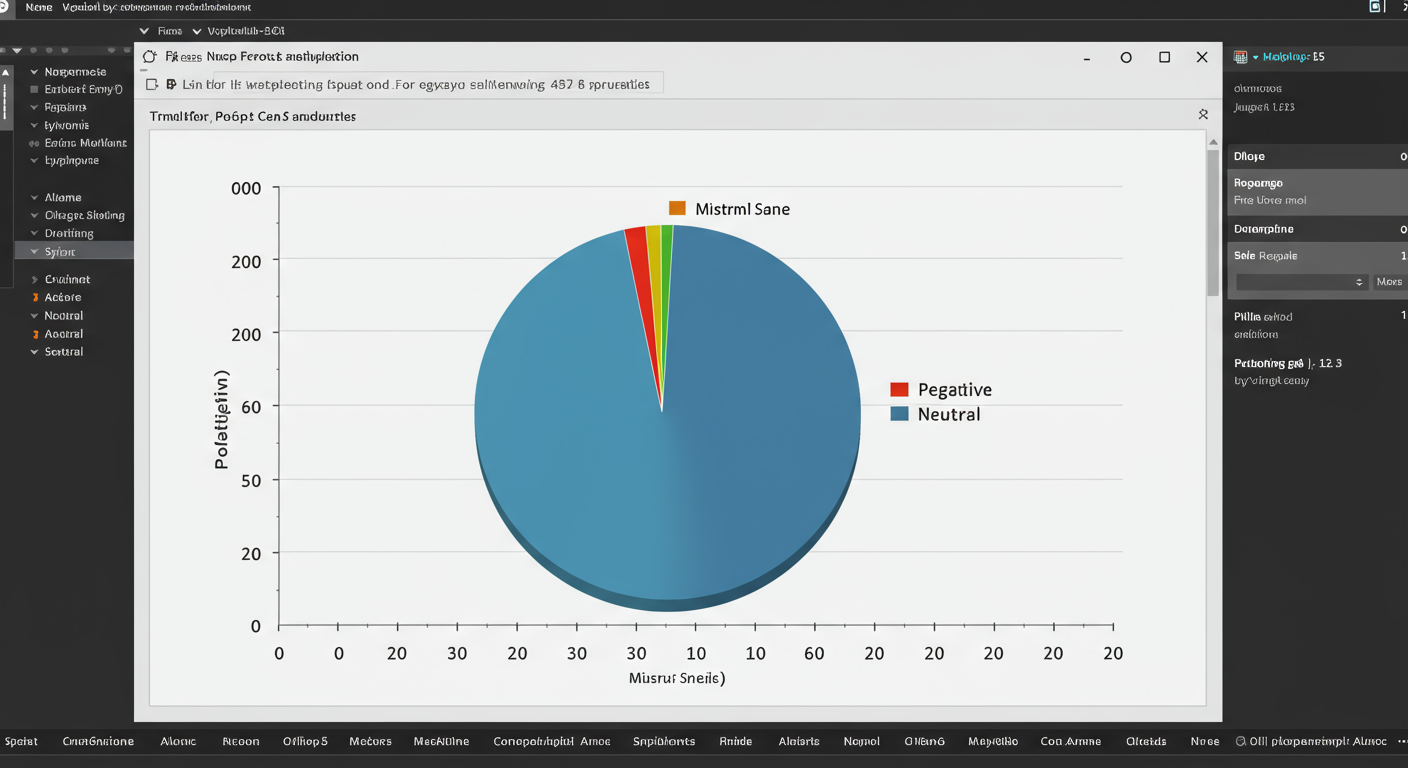
Cell 5: Create a Pie Chart
# Get the count of each sentiment
sentiment_counts = df['sentiment'].value_counts()

# Define colors for our chart
colors = ['#66ff66', '#ff6666', '#c2c2c2'] # Green, Red, Grey

# Create the pie chart
plt.figure(figsize=(8, 8))
plt.pie(sentiment_counts, labels=sentiment_counts.index, autopct='%1.1f%%', startangle=140, colors=colors)
plt.title('Sentiment Distribution of Tweets')
plt.axis('equal')  # Equal aspect ratio ensures that pie is drawn as a circle.
plt.show()
When you run this cell, you will get a clean pie chart that instantly tells you the overall public opinion from your Twitter data. You can clearly see what percentage of the conversation is positive, negative, or neutral.
Conclusion: From Raw Text to Actionable Insight
Congratulations! You have just built a complete sentiment analysis pipeline. You successfully loaded data, cleaned it, applied a sophisticated NLP model (via TextBlob), and visualized the results. This is a foundational skill in the world of data science and machine learning.
While TextBlob is fantastic for its simplicity, the world of sentiment analysis is vast. For more advanced projects, data scientists often use more complex models like **VADER (Valence Aware Dictionary and sEntiment Reasoner)** or even train their own custom deep learning models using frameworks like TensorFlow or PyTorch for higher accuracy on specific domains.
The project you completed today is more than just a tutorial; it's a powerful demonstration of how you can use Python to transform unstructured text into quantifiable insights. What other datasets could you apply this technique to? Product reviews? News headlines? The possibilities are endless.
